BRANDING & PACKAGE DESIGN

MicGrow
02-10-2025
ROLE:
DATE
CLIENT
Brief
MicGrow is a microgreens producer based out of Vancouver, British Columbia. The company was launched by owner Gulliano Pagano who saw that there were very few options for locally produced microgreens of high quality to meet the needs of fine dining establishments in the Vancouver area.
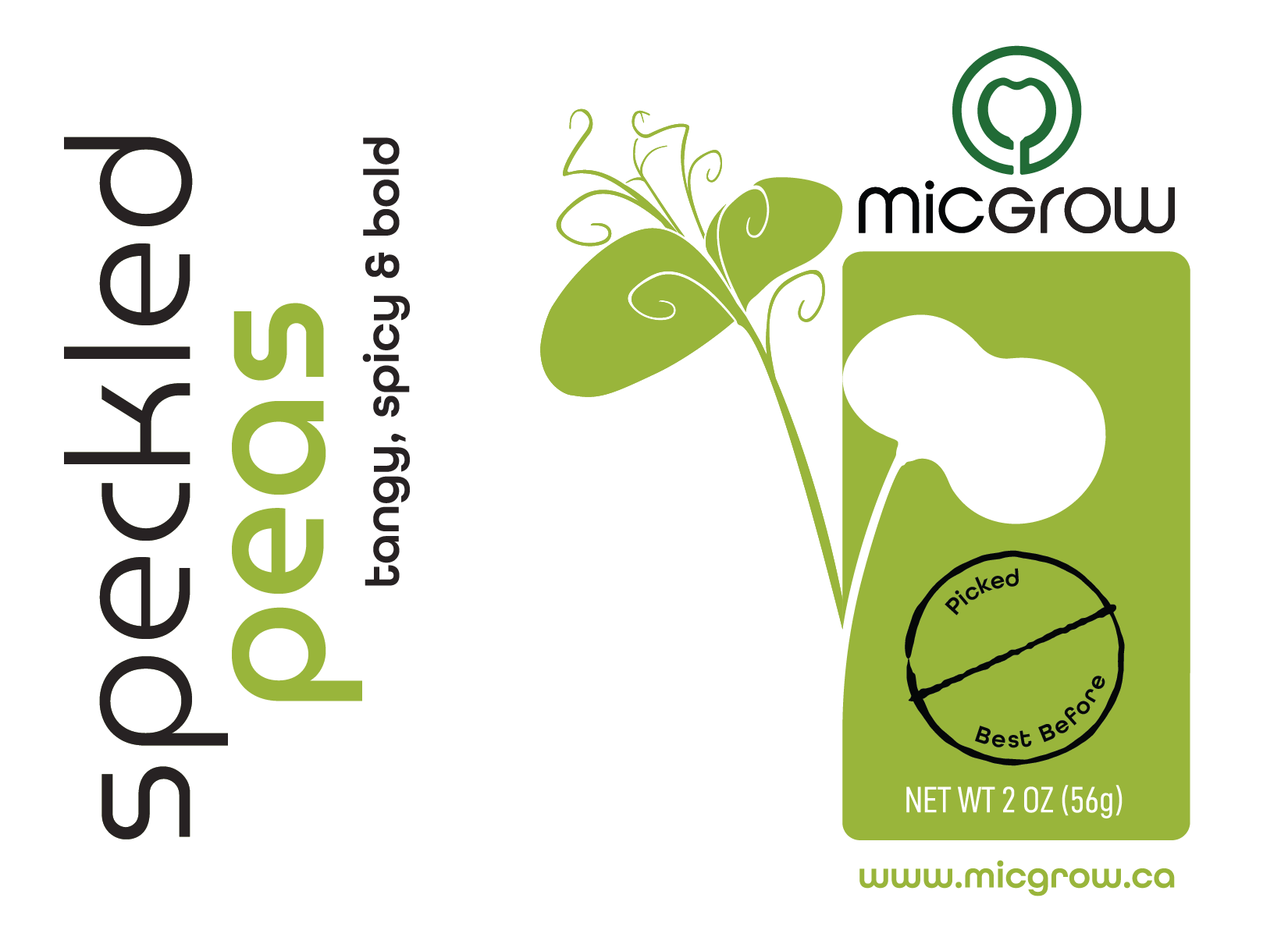
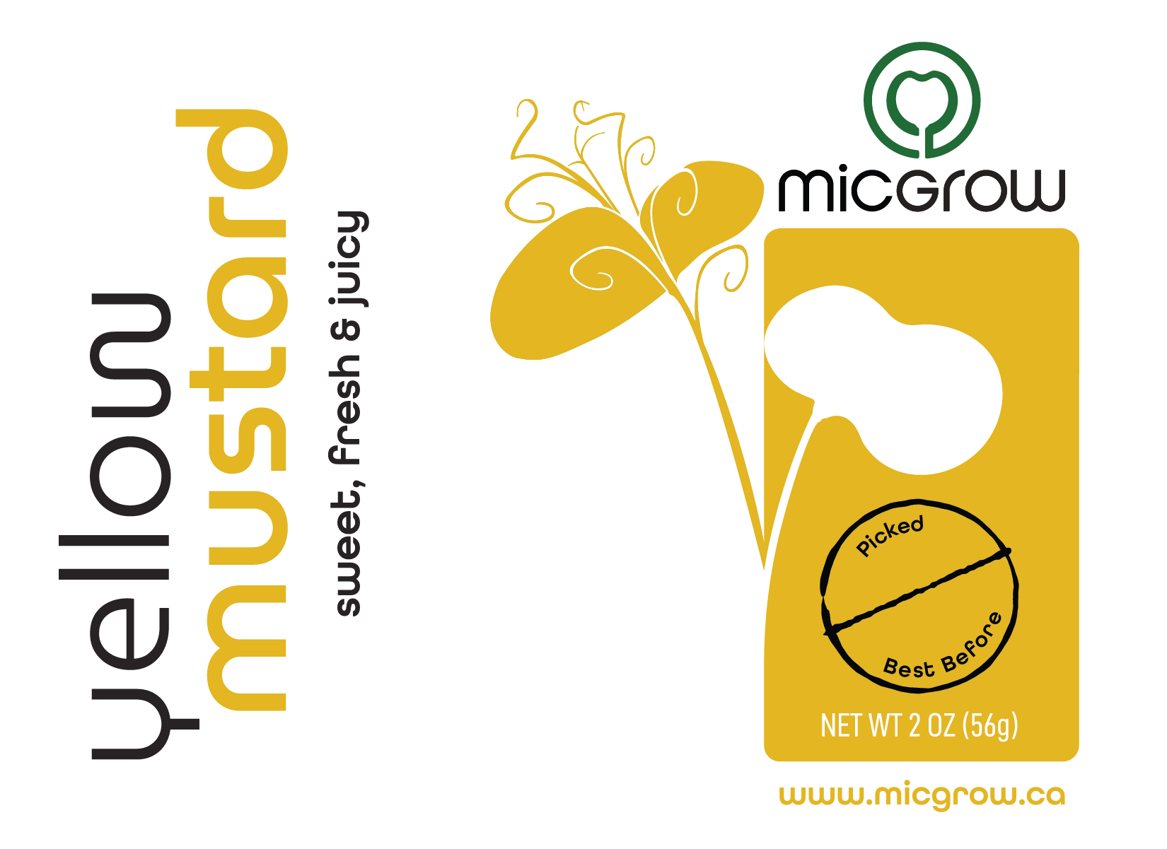
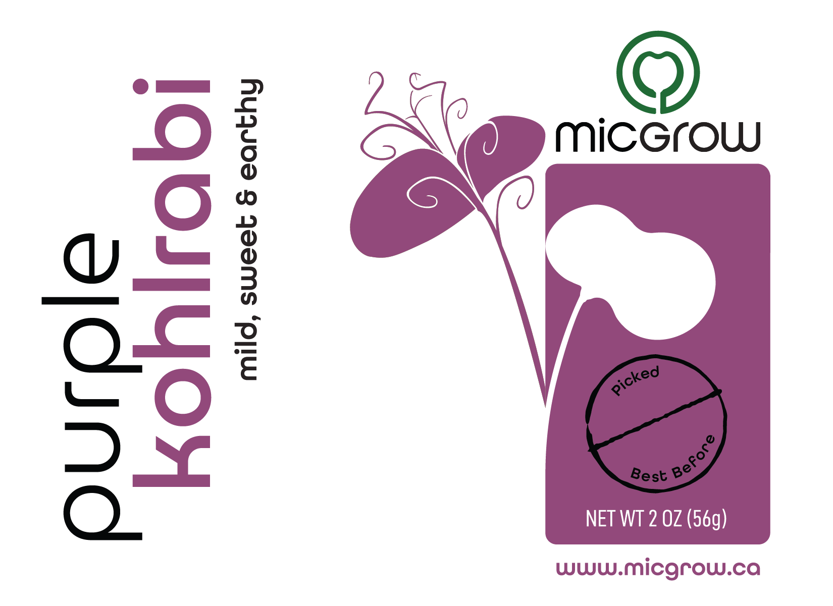
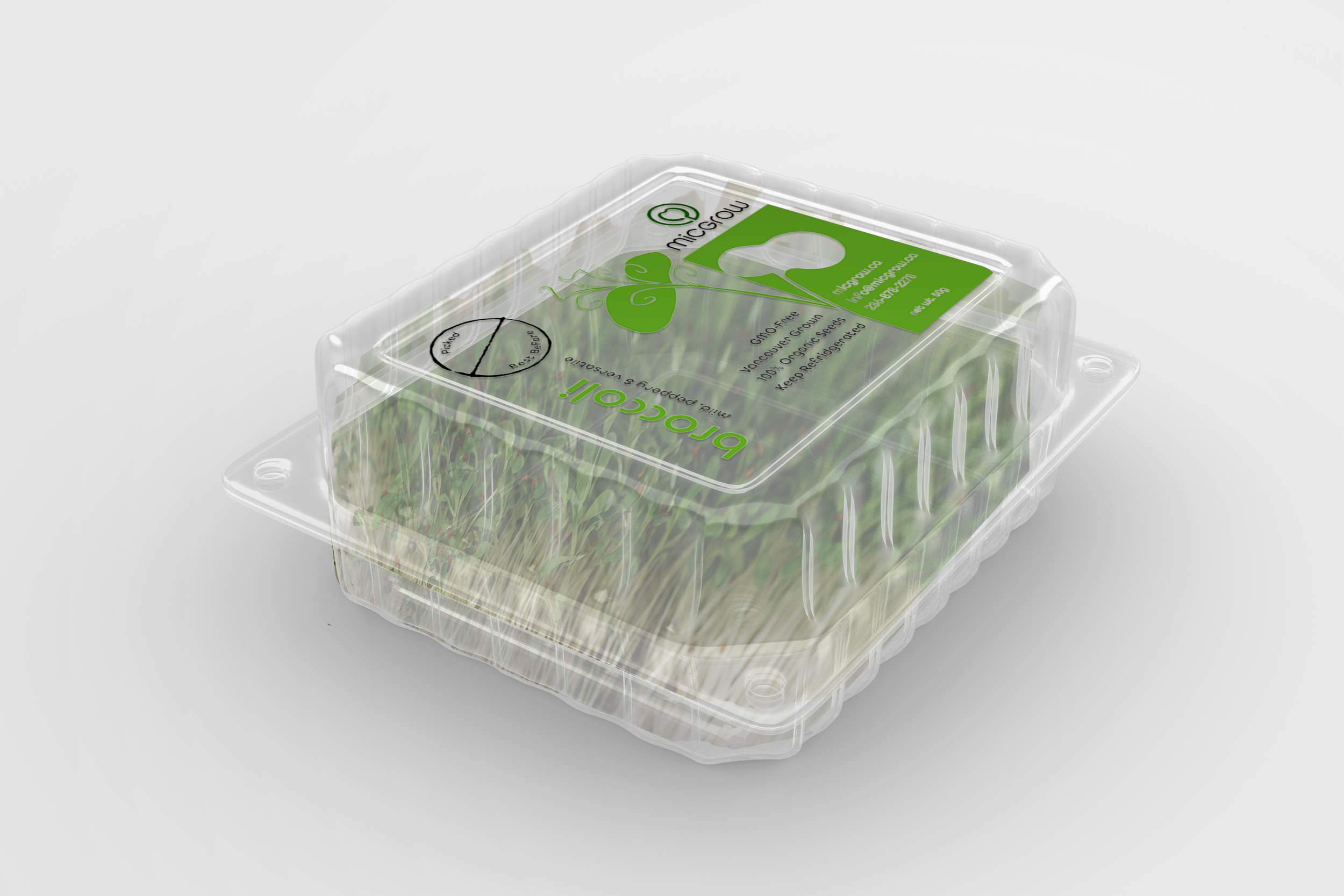
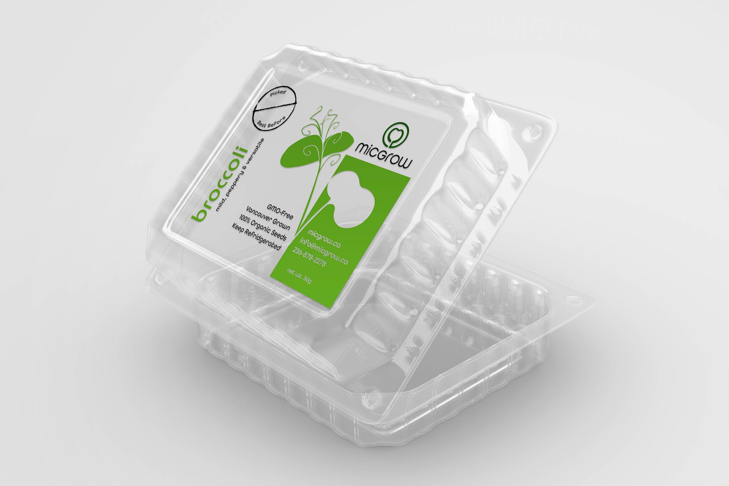
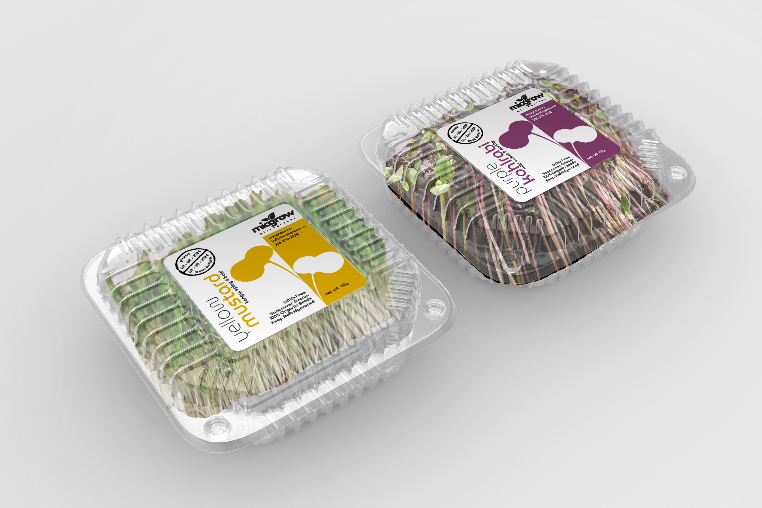
In addition to needing a brandmark that looked clean and professional and would help them stand out in the market place they also sought out packaging options and designs that could be used to help MicGrow expand from their primary customer-base — fine dining restaurants — and enter the grocery stores.
In this marketplace, targeting a broad range of consumers in a grocery store, having consistent branding and packaging design that made it easy to differentiate between the different microgreen offerings became more important for the business.
I designed the logo and the packaging for all of their microgreen varieties.
A key branding element for MicGrow is the shape of the sprouting leaves. Most microgreens, whether it’s purple kohlrabi, red kale or speckled peas, start with this shape as the sprouts leaf emerge. The negative space at the centre of the logomark is a silhouette of the sprouting leaves and the outline around the sprout leaves froms the letter ‘M,’ drawing a subtle parallel to the name of the brand — MicGrow.
In addition to the brandmark I also worked on these other needs of the client:
business cards,
brochures,
order forms,
packaging design
Designer
Production