BRANDING & VISUAL IDENTITY
Ghost Marks
11-15-2025
DATE
CLIENT
Brief
Ghost Marks is a new business initiative spearheaded by Kat Michitsch, a body piercer located in Toronto, Ontario. Kat has established herself in the piercing industry, with a career spanning over two decades.
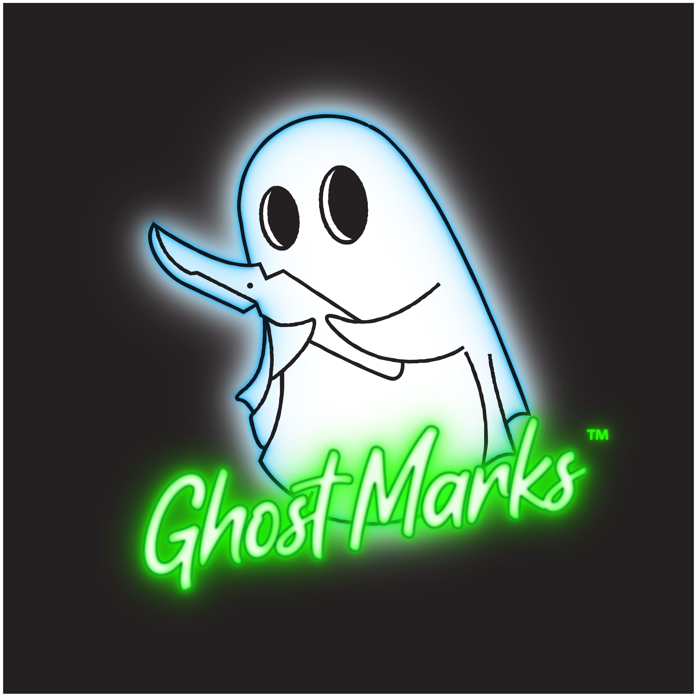
Kat sought to create a memorable brandmark for Ghost Marks. Something fun that also highlighted a very unique offering of her new business — glow-in-the-dark scarification. Using a phosphate-passivated strontium aluminate glow powder in the process, Kat is performing scarification on clients that glows!
I drew inspiration from the visual characteristics of the artwork for the 1984 blockbuster “Ghostbusters" for this logo mark. The colours used in the branding are based on two of the three colours that Kat offers to her clients when they request glow-in-the-dark scarification.
This project is very recent, and some of the additional branding elements are still being created along with other client needs, including:
business cards,
brochures/handbills; and,
a website
ROLE:
Designer
Copywriter
Web Design
Production