BRANDING & VISUAL IDENTITY
CLIENT
Fat Cat Construction Company
Brief
Create a fun, memorable logo that would help Fat Cat Construction Company stand out in the crowded field of construction and renovation companies in Southern Ontario—while still communicating reliability, skill, and professionalism.
The logo was designed for my younger brother, who has worked in the trades his entire adult life. While personal in origin, the goal was to produce a brandmark that could confidently operate in a commercial context and resonate with real clients.
The construction and renovation landscape in Southern Ontario is visually saturated with generic branding—heavy use of block lettering, hard angles, and predictable symbols (hammers, houses, rooftops). This visual sameness makes it difficult for small, independent contractors to differentiate themselves or be remembered.
At the same time, any branding solution needed to avoid feeling gimmicky or unserious, as trust and credibility are critical in trades-based businesses.
Design Solution
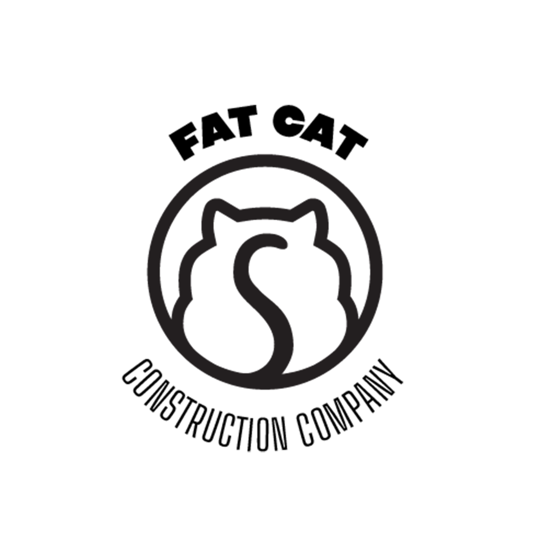
The solution was a distinctive, character-driven logomark centred around a stylized “fat cat”—a playful but confident nod to the company name and to a well-loved, rather rotund family cat. The illustration was carefully balanced to feel friendly and approachable without undermining the professionalism of the business.
The resulting logo stands apart from typical construction branding, offering personality and memorability while remaining clean, legible, and adaptable across work vehicles, apparel, tools, and marketing materials.
ROLE:
Brand & Visual Identity Designer
Concept Development & Illustration
Creative & Communications Consultant
DELIVERABLES:
Primary logo and logomark
Scalable vector artwork
Colour and monochromatic logo variations
Assets suitable for print, apparel and vehicle applications